

AIDGEARS
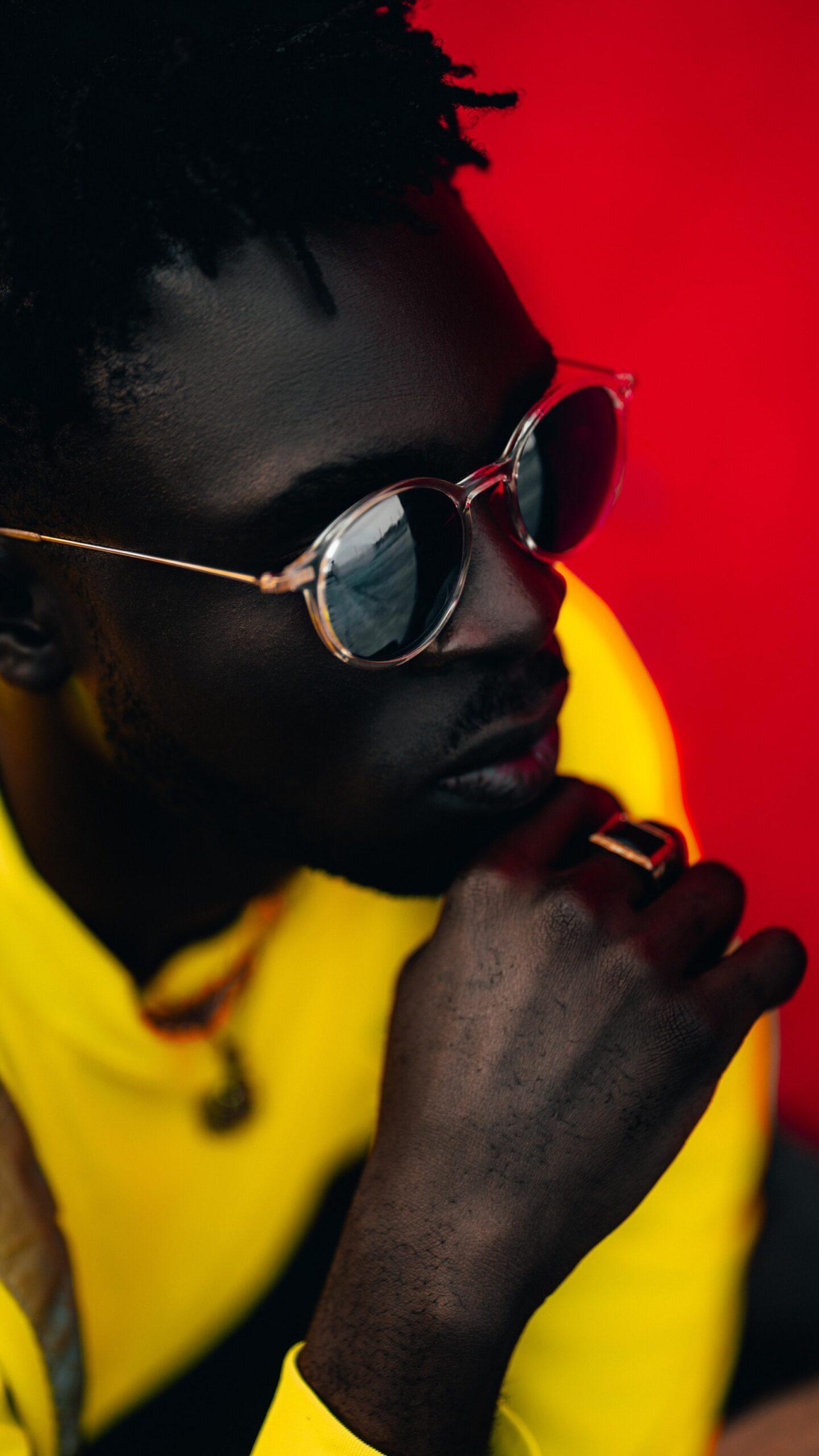
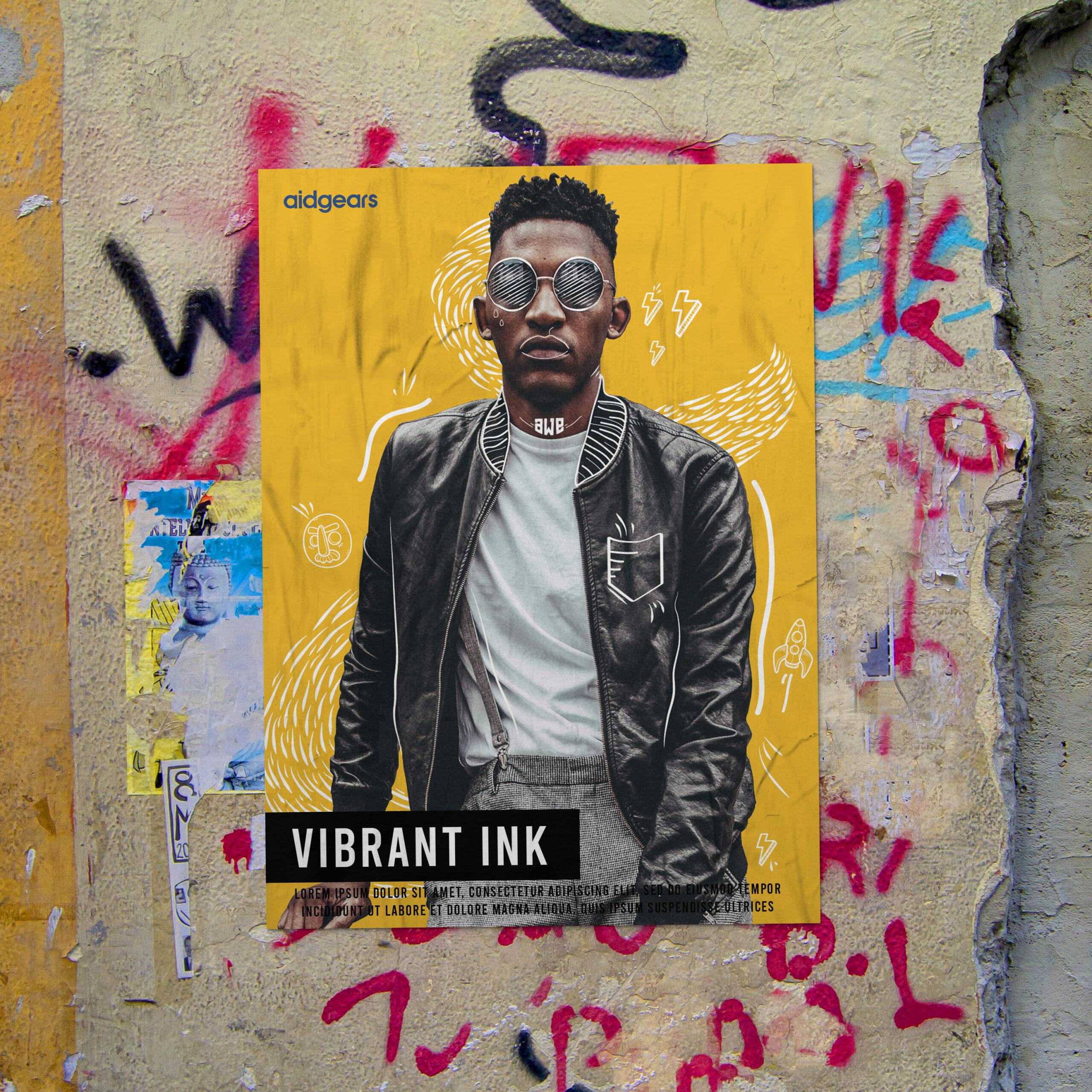
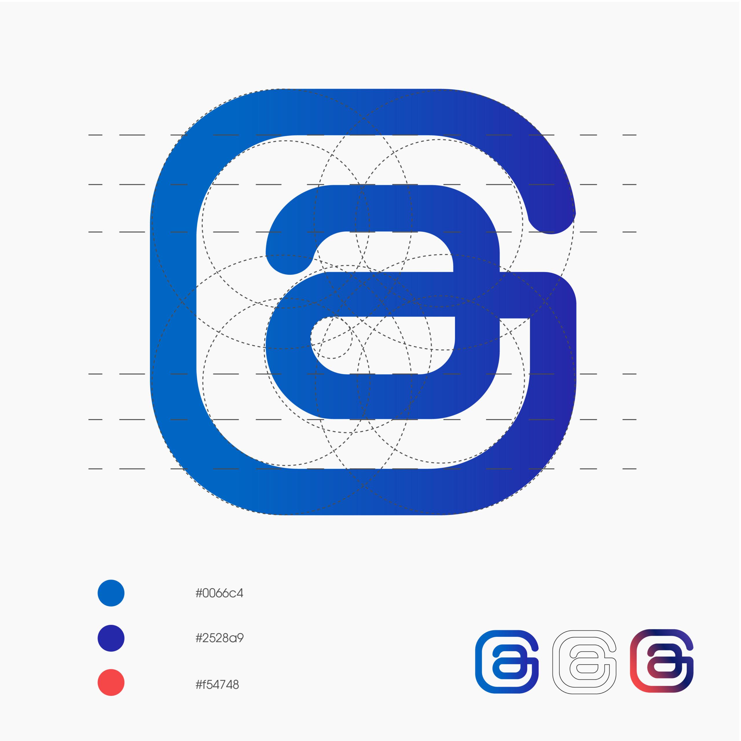
After copious amounts of brainstorming, research, and way too much coffee, we came to the conclusion that the personality of the brand communicates a bold, African, and dominant style that directly translates to the target audience. The results were primary colors, street-based images, and a combination logo made of geometric lines with rounded edges. Aidgears distributes printer ink and in order to steer away from the generic clutter of saying it’s quality color, the brand and advertising show it’s a good color.
The print campaign images are printed with their ink. We took a tongue-in-cheek approach with a play on the words “ink” which relates to tattoos as well as the cartridge ink and delivered a campaign around the permanency of the product. The attitude that it confidently portrays stems from the same attitude the client professionally gave us during a think-tank session – and it stuck.
CLIENT
Aidgears
PROJECT DATE
September, 2020