
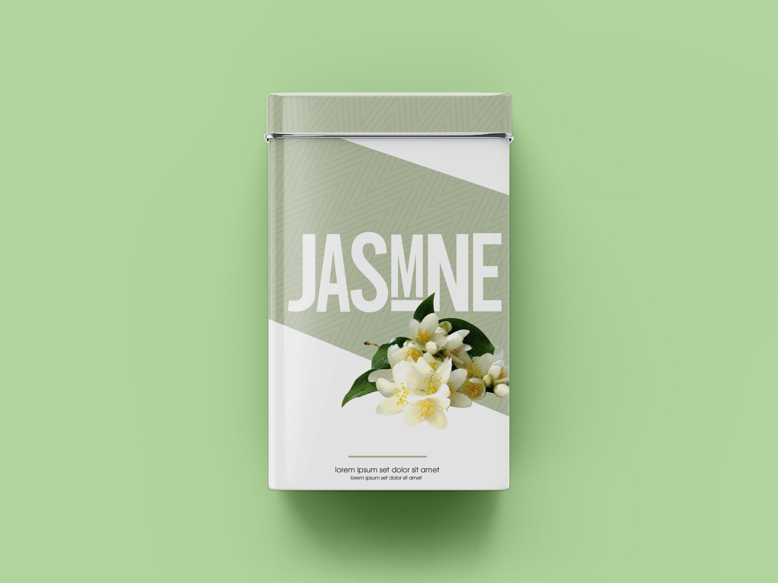
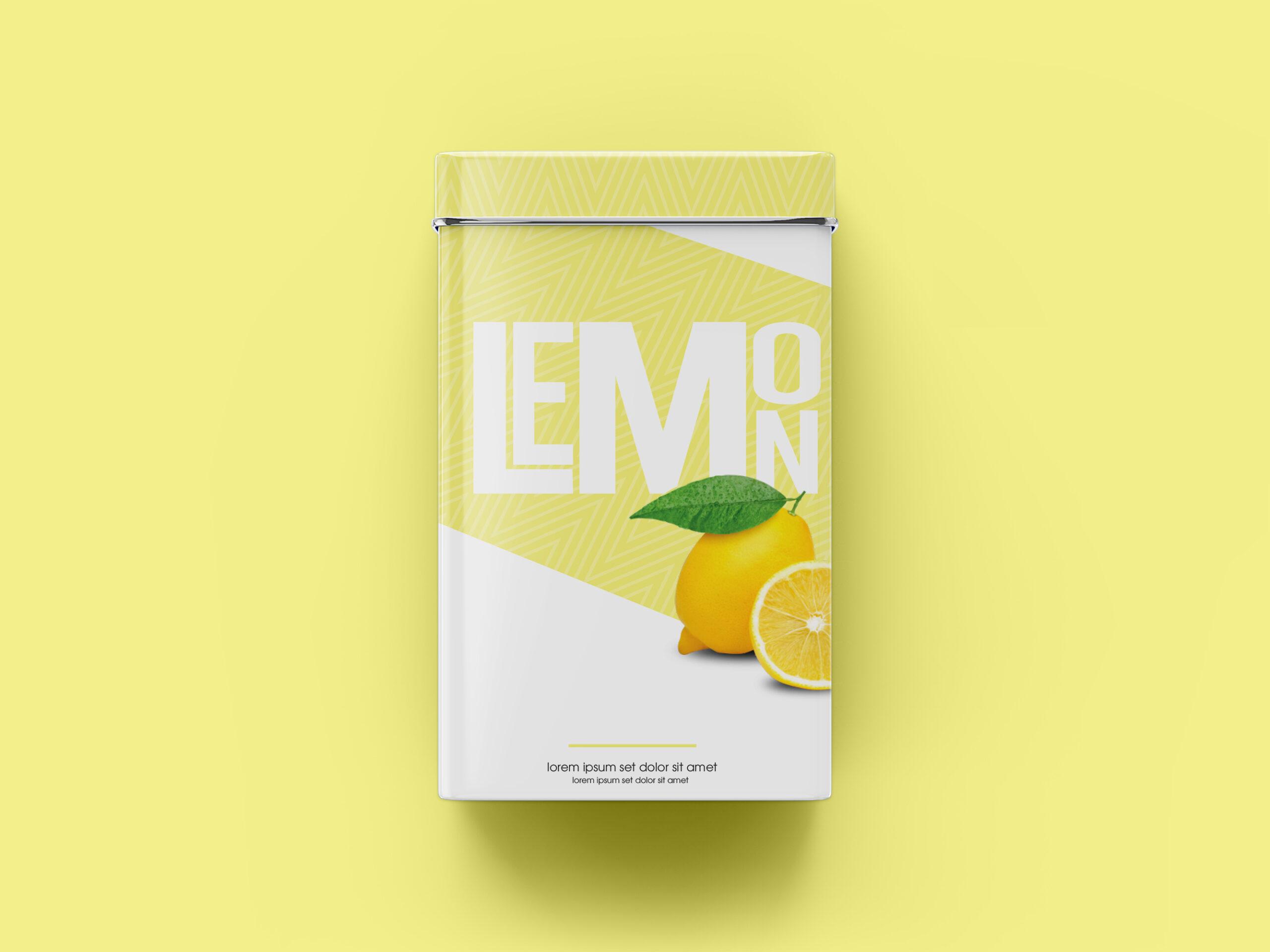
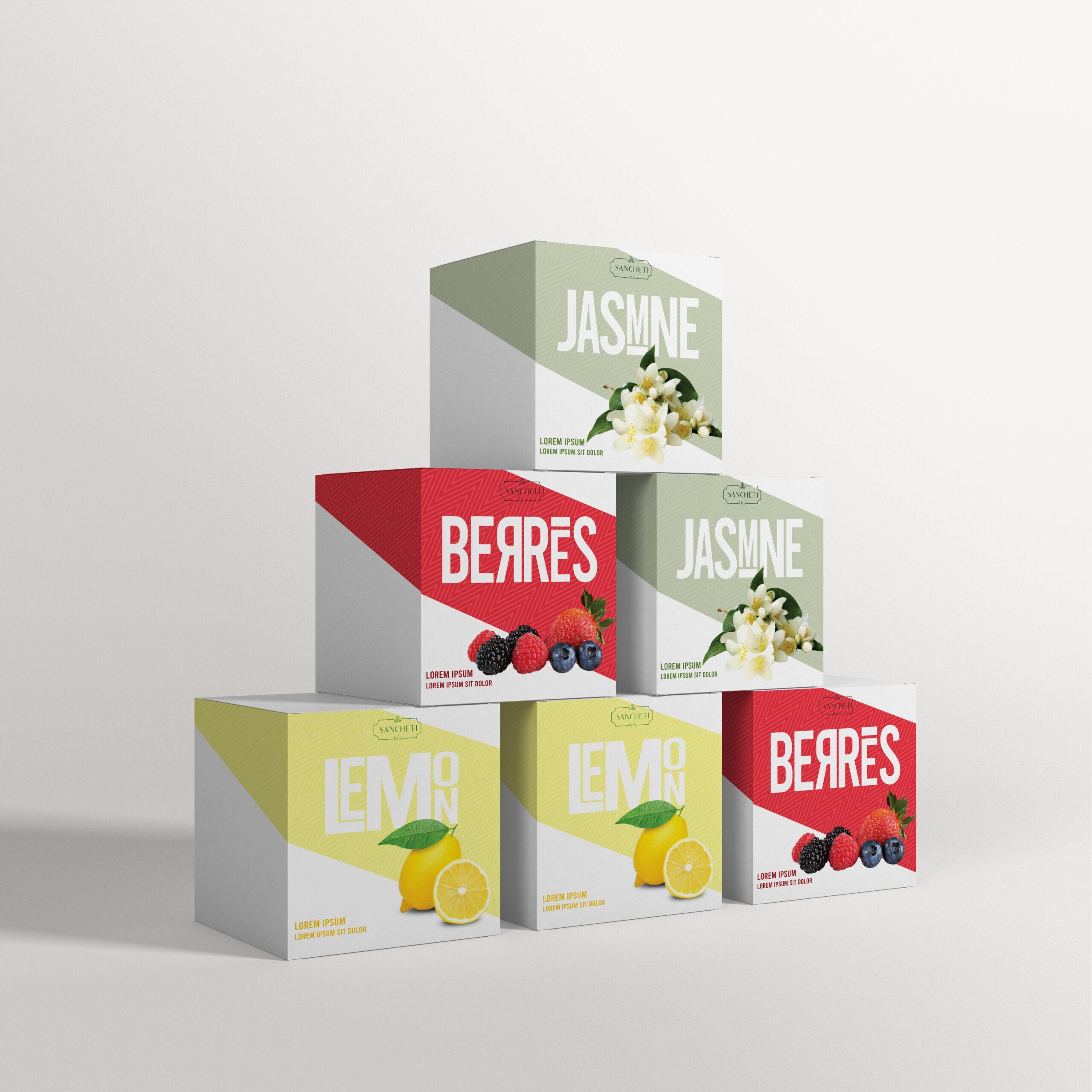
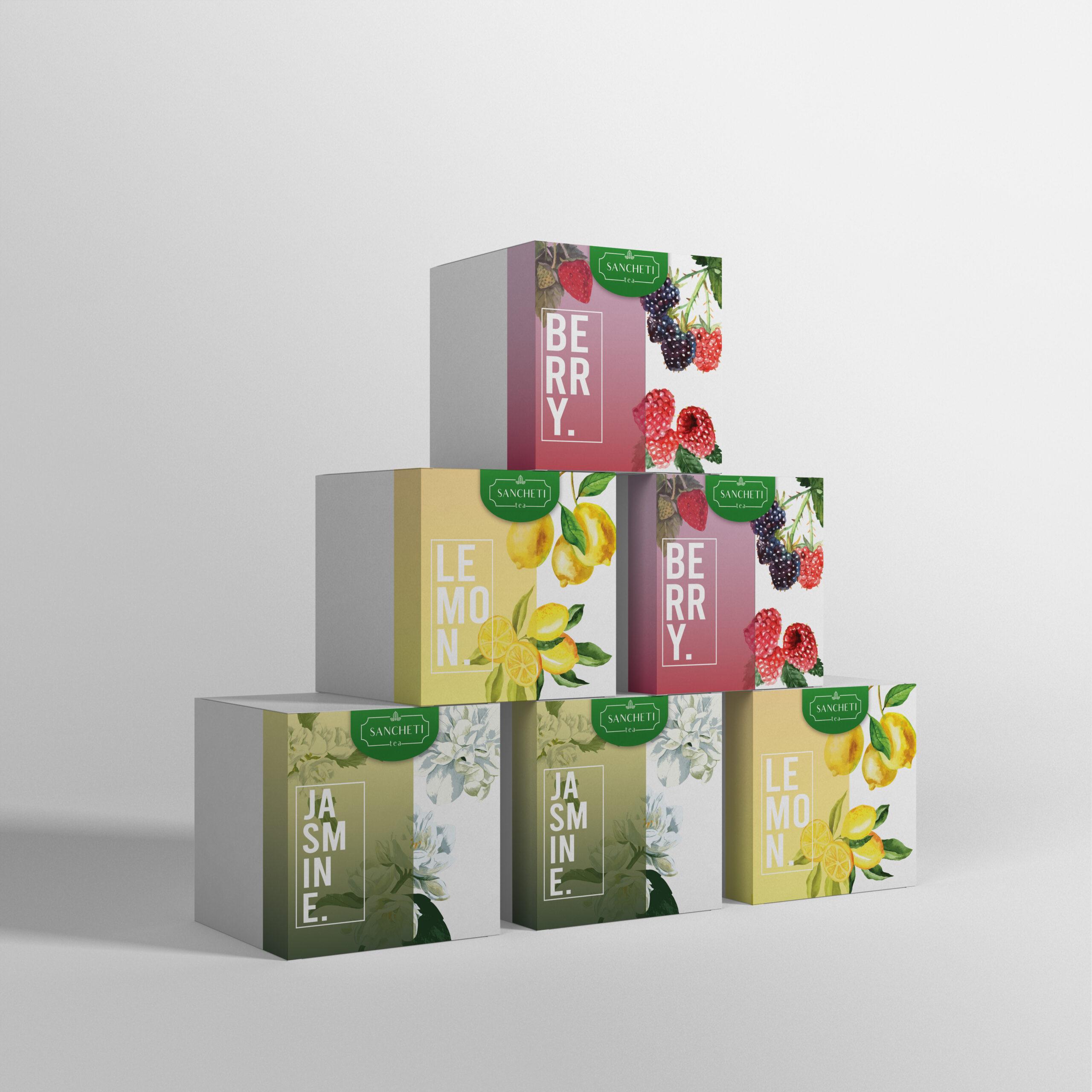


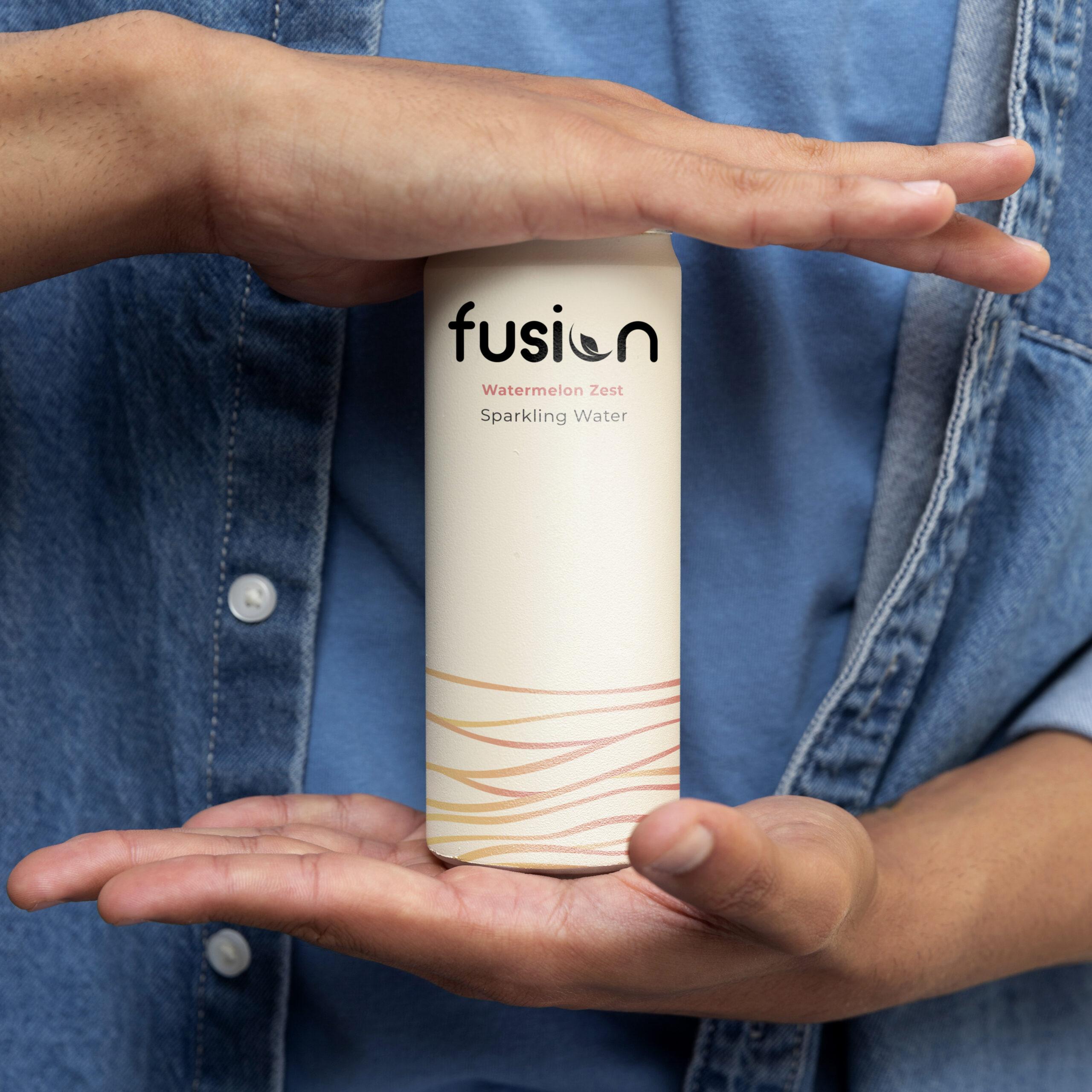
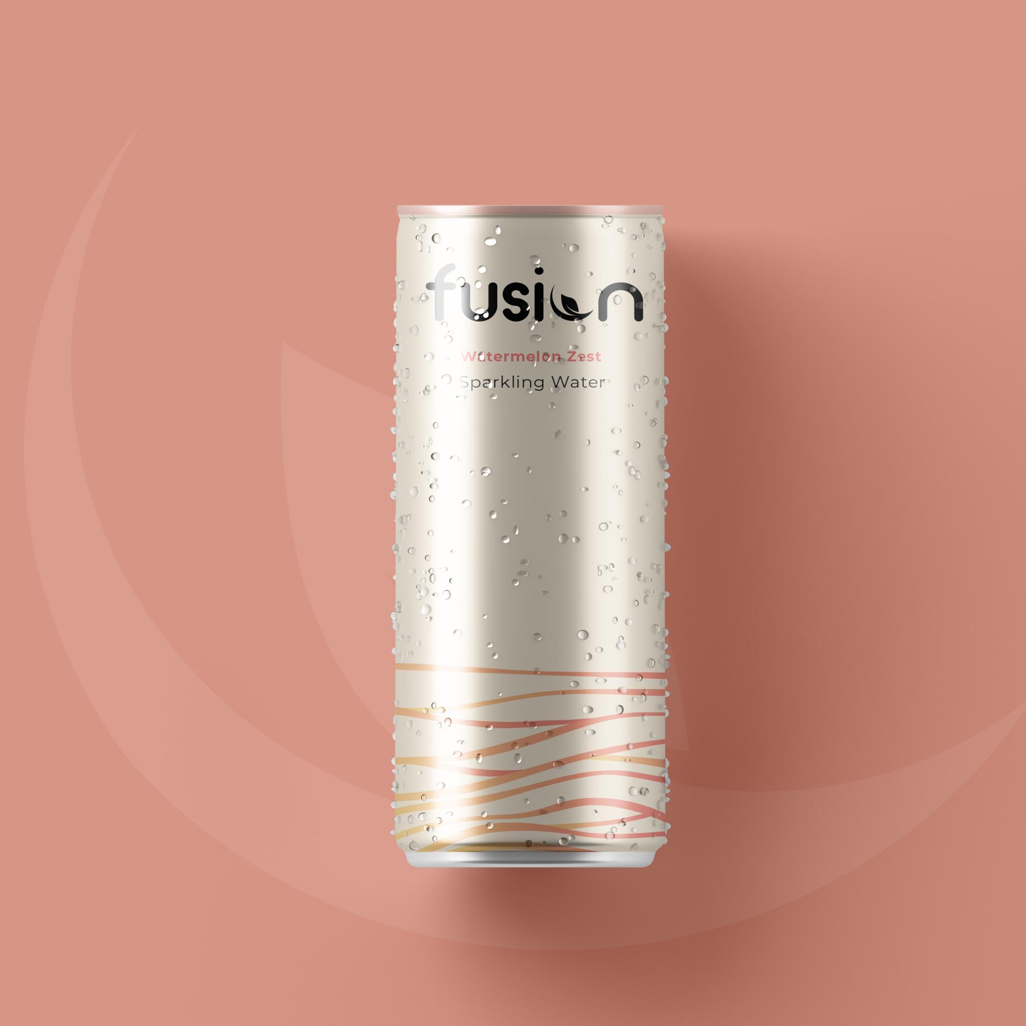
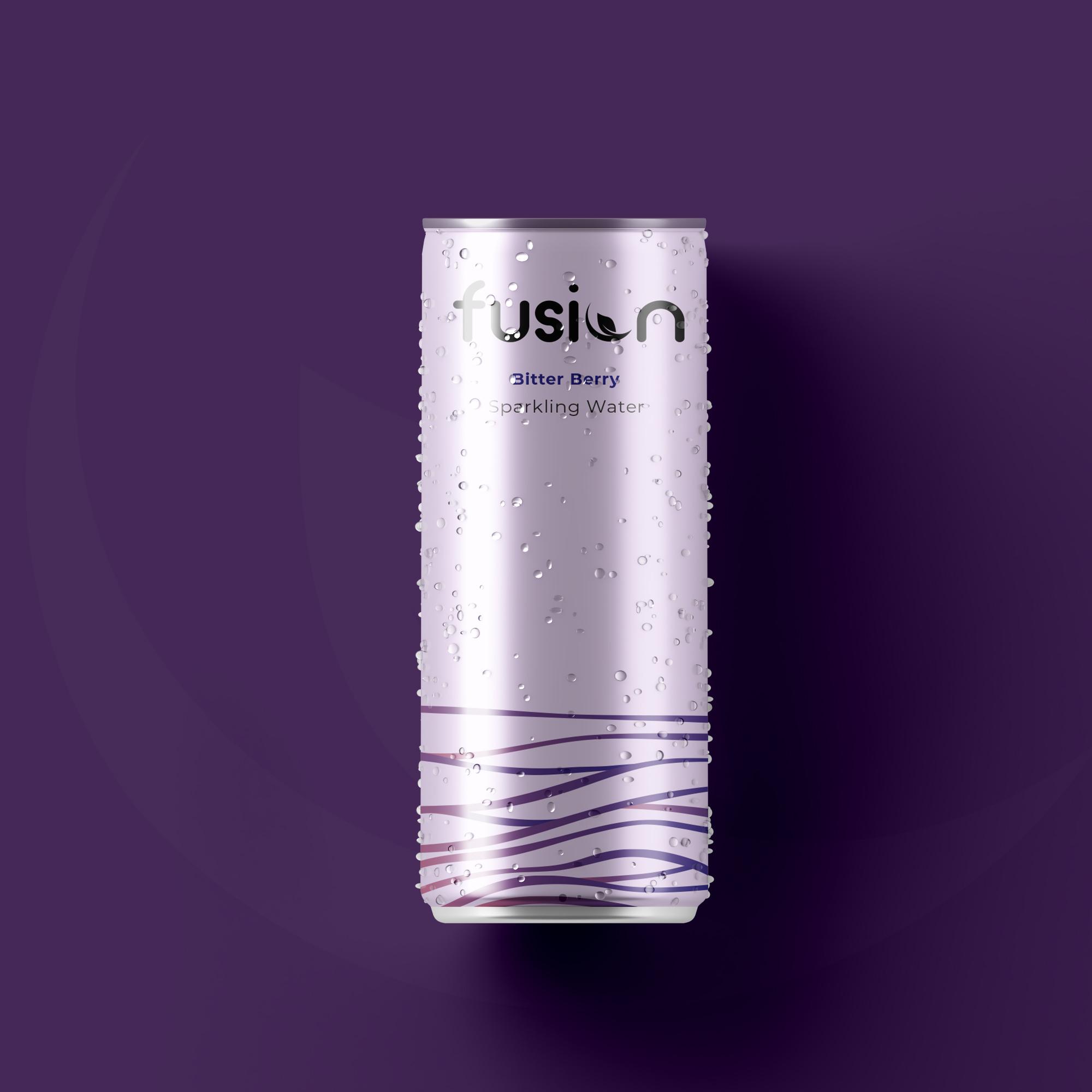
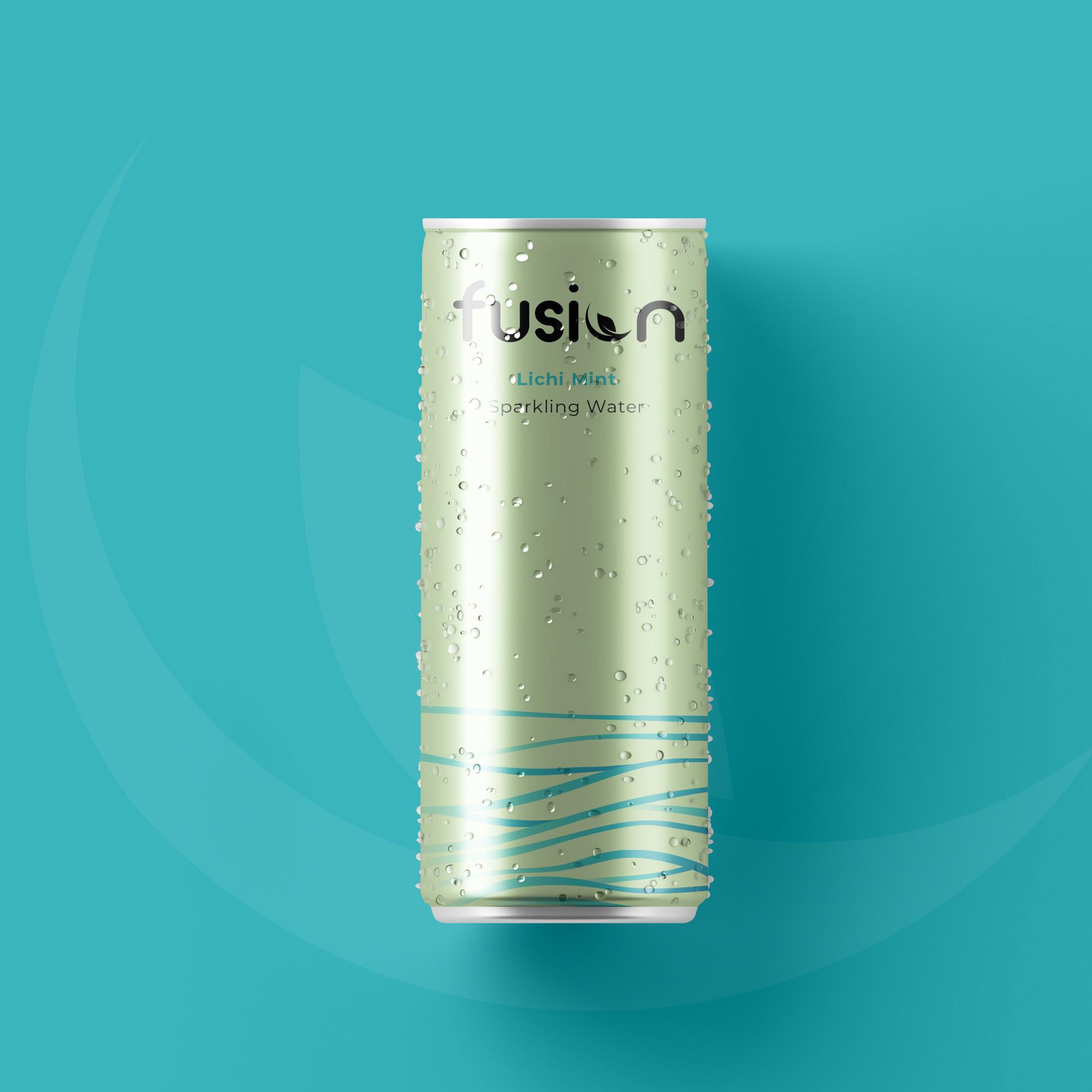
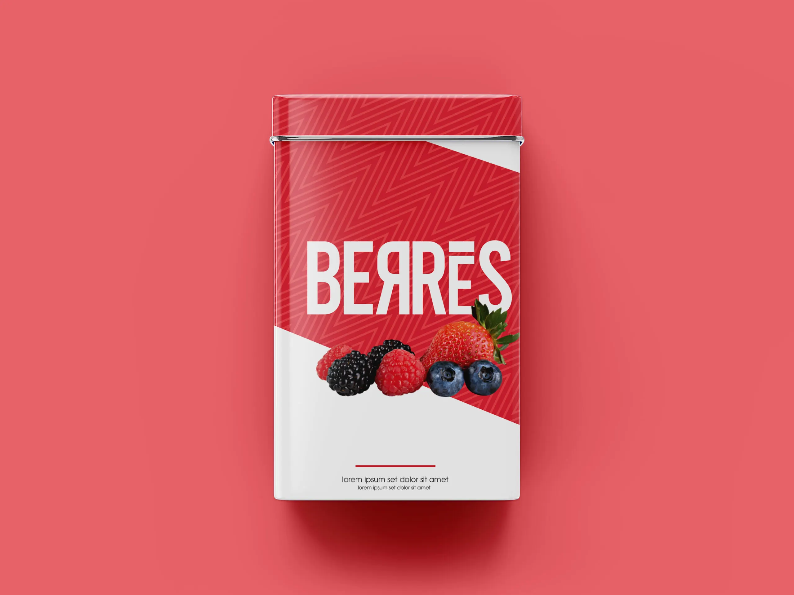
Sancheti and Fusion
A lovely, fruity brand from India that required some assistance is logos and packaging for teas. They had two separate visions, both bold, friendly, and vibrant. The careful combination of modern and Indian came hand in hand through celebrating patterns and bold colors while using standard fonts and negative space in order to truly communicate the essence of Sancheti.
CLIENT
Sancheti/Fusion
PROJECT DATE
October, 2020
